One of the first things most people want when starting their own business is a logo. Not just something that looks good, but something that captures the heart of the business you’re building.
I went backwards and forwards more times than I can count trying to get it right. My favorite color has always been neon green, but as NoahPrints began to take shape, so did the core idea behind the brand.
Inspired by the Print Bed: SunLu Tile PLA
The real breakthrough came after discovering my absolute favorite filament to print with—SunLu Tile PLA. Suddenly, it all started to click.
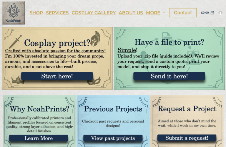
The tile shape became much more than just a material—it became the inspiration behind the website itself:
- Tile-Based Navigation: The homepage is built around a collection of tiles, each one leading you somewhere different.
- Focus on What Matters: Rather than forcing you through endless lists and clunky menus, the tile layout makes the important products and custom services stand out naturally.
- A Clean Identity: And that’s how the NoahPrints logo was born—simple, clean, and something I’m genuinely proud to put my name behind.